Manganese Mission Accomplished

Manganese Mission Accomplished: How You Can Find Genuine Manganese Blue, or the Closest Thing To It
Genuine Manganese Blue, an "extinct" pigment that is no longer manufactured, is part of an important part of the painter's color box. In the last article, I shared why it's worth tracking down. If you have a sneaking suspicion you'd like to try it, or even a strong curiosity, here we'll talk about tips to help you find the real thing. There are two ways to go about finding this color: you can either buy the real thing, or try to get close, but either way you're going to need a strategy. Here's how to give it your best shot.
On A Mission to Find Manganese Blue Paint
On a sunny afternoon last fall, I visited our local art supply store with a hope cherished in my heart that was, by all accounts, unlikely to come true. My husband and I were on a mission to find an old, unsold tube of Genuine Manganese Blue. To give you an idea of what I was up against, production of this pigment had ceased by the 1980s, and the remaining stock in art supply stores had been all bought up by about 2007. The idea of finding it on the shelf anywhere was a long shot. However, there were a few things about our local store that made me think that finding old paint there was within the realm of possibility.
The first order of business was checking out their imported oil paint stock just in case there was an old tube of paint that had been highly priced (as an import), and as a result had never sold. As I worked my way through the blue section, my heart leapt up as I saw the object of my search— “Manganese Blue" only to read the rest of the name, which ended with "...Deep.” It was a mixture. The Manganese Blue was genuine, but it had been pre-mixed with a shade of violet. I looked longingly at the Manganese Blue slot, which was, naturally, empty, and debated whether I should buy the “Deep” variety. My husband very generously thought I should give it a try, but since it was not pure Manganese Blue Pigment, I decided to pass. Several weeks later, I visited the store again to buy supplies, and I happened to need a different color from the same brand of high-end paints. For no good reason, I decided to double check the blues again. Something on par with a miracle happened, and my eyes fell upon a single tube of Genuine Manganese Blue where there had been none before. I did a momentary double take— it seemed impossible. The manufacturer, Old Holland, no longer makes the genuine kind, so it could not have been a newly stocked tube, but there it was, with correct pigment data for Manganese Blue Genuine, PB33.
The amusing part of this story is that my luck in finding this pigment came after going through all the other methods I am about to share with you for finding or approximating this beautiful blue. So if you’re in need of something in the teal-cyan-cerulean neck of the woods, we’ll survey all the options of how to get there, so you can choose the route that’s best for you.
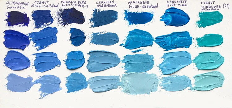
Above is a comparison of all the blue paints available on the market, with the addition of Genuine Manganese Blue. (For genuine Manganese, see the columns 2nd and 3rd from the right). All samples are mixed with Williamsburg Flake White.
Which blues are already on the market? In the previous post, I took a look at all the available blue pigments available to fine art painters.
Do You Have Real Manganese Blue?
How to Tell the Difference
Here’s the main tip on how to find Genuine Manganese Blue: check the pigment number on the back of paint tube. Many companies sell Manganese Blue Hue, which is not the same thing. To find the real deal, look for PB 33.
Whether you want to find Genuine Manganese Blue on eBay or from a boutique paint manufacturer, or you’re looking for a substitute, knowing your way around pigment numbers is pretty much a necessity.
What is a pigment number?
For the benefit of painters everywhere, the actual materials used to create a shade of paint are given a certain code, which you can find on the back of each tube (that is, if the manufacturer is a reputable manufacturer, and the materials are high quality). If the pigment information is not disclosed, there is usually a reason, and it could be an indication that there is something to hide.
As an example of how to interpret pigment numbers, let’s take the color called Phthalo Blue. On the back of the tube, you'll see something like PB 15. Think of the P as “Pigment”, the B as “Blue” and 15 is the number assigned to that particular chemical compound. The company could name it Sky Blue or Cerulean, or whatever suited their fancy, but if PB 15 is on the back you'll know that the pigment in the tube is Phthalo. There are several types of Phthalo discussed below, so if you see PB 15:1, that's one variety, or if it’s PB 15:3, that's another. Both will likely be labeled "Phthalo" somewhere on the packaging, however, there are differences in the variety of Phthalo pigments. Regardless of what the manufacturer labels the paints on the front of the tube, if you look on the back of the tube, you'll have a much better idea of what you are buying. There are lists online of all the regular dyes, pigments and colorants in use, so during your travels through the art aisle you can easily find out what is used as a colorant in that particular tube of paint.
So, back to Manganese Blue. Genuine Manganese Blue is PB 33. In contrast, Manganese Blue Hue is not going to be genuine. Anything labeled “hue” is likely to be a mixture of several pigments, in this case, Manganese Blue Hue is basically an approximation or composite of other pigments in an effort to get close to the look of the real thing. However, it will not usually behave quite like genuine Manganese, and it will often include a pre-mixed-in white or a lot of fillers.
Here's a good tip in general: steer clear of buying a tube of paint with the word "Hue" in the name unless you really want that particular pigment blend as a convenience. Check your pigment numbers and be sure about what you're buying.
How to Find Genuine Manganese Blue: Strategy

Here's a shot of the old tube of Genuine Manganese Blue paint (PB 33) that I found at a local art supply store. Note how different Old Holland Manganese blue looks from the Vasari Manganese Blue behind it, which is also PB 33. Even though both are technically PB 33, they are slightly different hues. This picture also provides a good point of comparison between Manganese Blue and Cobalt Teal (PG 50) in the foreground.
So, now you know what to look for (PB 33), but how do you find it? Here are my favorite strategies for finding this rare hue.
Buying Genuine Manganese Blue
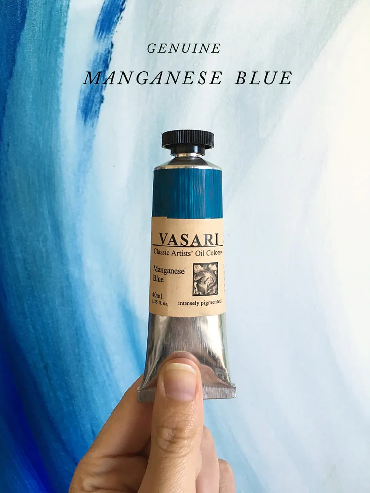
Since the original stocks of Manganese Blue were sold out of most art stores about 10 years ago, you’ll need a strategy if you’re going to go this route. You might be able to find some online, but that means you’re going to have to compete with other enthusiastic artists on eBay and get really lucky. At the time of this writing, a third option is available, which also falls in the “lucky” category since there is no telling how long it will last: Vasari is currently offering a limited supply of freshly made Manganese Blue.
Route #1: Buy it from Vasari. It’s a little different color than the Old Holland variety, but Vasari makes great paint. This brand of paint is characteristically “loose” and oil rich, so for some, that is a drawback. However, Vasari is the only manufacturer selling this new. They have announced that they have “searched the world over” and found enough pigment for “several batches,” and state that the color is indeed PB 33.
Route #2: Ebay. This is tricky, but you might be able to find different brands that have other paint handling characteristics. The trouble is that the phrase “Manganese Blue Hue” has gummed up the search results when it comes to looking for PB33 on the internet. It takes patient and careful work to find the real thing, and will likely involve lots of notes to sellers to clarify. Be sure to write sellers ask them to look for the numbers on the back of the tube. That way, you'll know you are getting PB 33 and not a mixture.
Route #3: Art stores. If they are a combination of being a little bit dusty and little bit overpriced, you might be in luck. Look for Genuine Manganese Blue in the high-end brands (remember, look for PB 33), since these are more likely to be paints that were purchased a long time ago by the store but haven’t sold.
A note of caution: Bear in mind that Genuine Manganese Blue is also highly toxic (but so are many of the other most valuable colors on the palette, so it's in good company). If that's a concern, that might be a reason to check out the substitutes, and mix your own out of less toxic materials.
Substitutes for Manganese Blue: Tactics

The color swatches below show how close other formulations can get to Genuine Manganese Blue
Ok, so in the hunt for Genuine Manganese Blue, perhaps cost or luck were not on your side, or perhaps you need something now, or maybe finding it just sounds like a lot of work (it is). Here's my best advice for getting close if you are after a better cyan.
Tactics for Mixing Cyan, aka A Flowchart for Upping the Ante:
Tack #1: Try to mix cyan with whatever variety of Phthalo Blue in already your paintbox (I'm assuming you have this ubiquitous pigment-- if not, no worries, be sure to read point #3 before buying some). Try pulling the mixture toward green if it’s too blue— I would recommend PG 7 — a blue leaning Pthalo Green in addition to whatever Variety of Phthalo Blue you have. If the mix is unsatisfactory (i.e. you have to add a lot of white, and it gets chalky or the mix is too dull), take a look at tacks 2 and 3.
Tack #2: If you happen to have Cobalt Turquoise or Cobalt Teal (PG 50), try that in your mix instead of using white. I used this tactic when painting a gouache commission, and it worked well. PG 50 has an inherent lightness and leans toward cyan so it’s a little less chalky than white. If you are still wishing for something a little more cyan, proceed to the next step.
Tack #3: Dust off those pigment numbers again and examine which kind of Phthalo you're using. Some Phthalos lean a little warmer than others, and that will throw off your ability to hit a bright high saturation blue-green. If you are unsatisfied with your results, try Winsor and Newton’s Phthalo Blue (Greenish) labeled as PB 15 or a Phthalo Blue labeled PB 15:3. In general, PB 15:3 is a good bet. It turns out that this particular kind of Phthalo does the trick better than most others.
In summary: There are two mixes I recommend: Phthalo PB 15:3 with PG 7 and white, or mixing PB 15: 3 with Cobalt Teal/ Cobalt Turquoise PG 50 is a great way to approximate this shade. (Either instance of PB 15:3 can be substituted perfectly with Winsor and Newton’s Phthalo Blue Greenish PB 15, but other tubes marked PB 15 might not work as well). If you are struggling to hit the color you want, Winsor and Newton’s is the best bet.
Oh so many Phthalo Blues
To recap, there are many different Phthalo Blue formulations, and while most of them fly by the same moniker, "Phthalo blue," some lean towards red and others lean towards green. It's helpful to know which formulation you have, and the most surefire way to do so is simply to check out the pigment numbers. In the past, I'd noticed there were differences from brand to brand as to which formulation they chose for their "Phthalo" and how they chose to describe the color on the front. Here are a few of the options: PB 15:1, PB 15:3, PB 15; 4, or PB 15:6. (All are Phthalo Blues, but each one has a slightly different property, or a different leaning). Below is an example of the notation on the paint tube. Note that the front just says, "Phthalocyanine Blue." On the back, note the right hand side where it says PB 15:3.
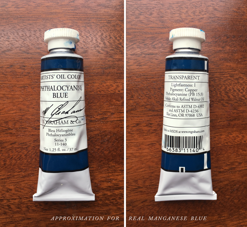
There are subtly different formulations of Phthalo Blue, and the pigment number on the back will give you the most information. The best daily-use Manganese Blue substitute is PB 15:3, or Winsor and Newton’s Phthalo Blue (Greenish) PB 15. Other formulations of interest are PB 16, PB 17, or PB 15:4.
*As a footnote to the discussion, many formulations of Manganese Blue Hue (the approximation commonly on the market today) are actually made with PB 15:3 and white. The problem is, when white is added, you can't have less of it. There are a few manufacturers that make a Manganese Blue Hue without the addition of white, and these are worth experimentation. Some use PB 15:4.
When approximating cyan in opaque media, like gouache, I found Cobalt Teal especially helpful. If you need to make the mix lighter, I would suggest starting by mixing in some Cobalt Teal or Cobalt Turquoise (PG 50), which is a naturally light pigment that looks pastel, but does not contain white. Cobalt Turquoise leans green, so it both lightens and creates more of a cyan color. This is a much more expensive pigment than something like Titanium or Zinc White, and that might be one reason why it is not sold as a mixture.
*As another aside, PB 17, sometimes called Peacock Blue, is another helpful color for mixing cyans. It seems to be a lot rarer and harder to find than PB 15:3. If you've worked with it before, I would welcome hearing your thoughts.
Manganese Mission Accomplished

New Genuine Manganese Blue paint from Vasari.
In sum, I am pleased with what Genuine Manganese blue adds to my palette, and also pleased that certain mixtures can come so close. However, there is something that will always be intriguing to me about the idea that some paints are not duplicable through other means, and that they have a specific note that others can try to approximate, but can never really add.
Have you experimented with genuine Manganese Blue, or any of its substitutes? Let me know what's worked for you in the comments below!