Artist Talk on Color Theory

Melissa Carmon shared the science behind her approach to color theory at an artist talk at Living Fire Gallery, where her work is on display.
Color and Neurological Perception
During my recent talk at Living Fire, I delved into the key theories about how we perceive color neurologically. Below are some photos from the presentation.
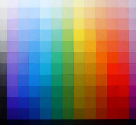
A page from Johannes Itten's book, The Elements of Color.
I still remember the day I found this illustration from Bauhaus theorist, Johannes Itten. I was in high school at the time, and by the light of an incandescent desk lamp, I read through Itten's Elements of Color. This illustration from Itten’s book has shaped the way I use and understand color.
At the Artist Talk, this diagram was part of the information I presented, because Itten’s illustration an excellent example of the relationship between hue and value. Our brains perceive the luminance value (think of a black and white photocopy of a color photo) regardless of which hue is assigned to the value. However, each hue will read as more or less chromatic at different value levels. Itten’s chart shows that a bright yellow is a very high value, where purple at the same value reads not a royal purple but as lavender.
These were some of the principles I used to choose the palettes in my non-native color portrait series, which was on display.
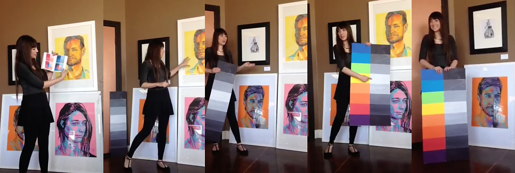
For the sake of demonstration, I made a different chart which borrows from the ideas in Itten's chart. The idea was to help make the relationship between hue and value even more clear. The large value scale I created roughly corresponded to the hues found in a rainbow.

Melissa Carmon gave an artist talk at Living Fire Arts
Other topics addressed at the artist talk included simultaneous contrast, non-native color usage, and color relativity.
A big thanks to everyone who came to the talk and made the event such a delight.
Curious about color? For speaking inquires, drop me a line in the contact section of the website.